The short version
Swing Finder runs two complementary scoring systems over every trendline currently within ~4% of price (an active line):
| System | Question it answers |
|---|---|
| ML rank scores (this page) | Across all stocks today, which trendlines are the model's most confident picks? |
| Statistical probability (explained here) | For this specific line's feature pattern, what fraction of historical look-alikes held vs broke? |
The ML scores rank tickers relative to each other. The statistical model speaks about a single line in isolation. They're best read together.
The 6 models
The horizon picker on the chart page lets you switch between 6 trained models. Each model produces two scores per stock: one for how strongly it leans up over the horizon, one for how strongly it leans down. The number you see is the sum of those two, so high scores flag predicted upside and low scores flag predicted downside. There are two families:
Direction (4 models): "how much time above purchase, and how high?"
These rank tickers by how much the price spends above (or below) the purchase price across the horizon. A high score means the model expects the ticker to climb fast and stay up; a low score means it expects sustained weakness; middle scores mean no directional conviction. Useful for buy-and-hold and short-side selection. The four are independently trained networks that differ in look-ahead window:
| Model | Look-ahead window |
|---|---|
| Direction 30d | Next 30 trading days. |
| Direction 60d | Next 60 trading days. |
| Direction 90d | Next 90 trading days. |
| Direction 120d | Next 120 trading days. |
Volatility (2 models): "how big does it move?"
These rank by the magnitude of the extreme move inside the window, regardless of direction. Useful for spotting tickers about to move sharply when you don't care which way. The green-area-minus-red-area framing below applies to Direction only; Volatility uses a different label (size of the biggest excursion, not integrated area).
| Model | What it predicts |
|---|---|
| Volatility 30d | Size of the biggest excursion (up or down) in the next 30 trading days. |
| Volatility 60d | Size of the biggest excursion (up or down) in the next 60 trading days. |
What the Direction score actually measures
The Direction models don't predict where price closes at the end of the horizon. They predict the area the price spends above (green) or below (red) the purchase price across the whole window. The score is green-area minus red-area. A stock that rises fast and stays up scores higher than a stock that ends at the same price but took the whole window to get there. Three shapes that drive the point home:
Mechanically: each model has two heads. path_up averages the daily distance above the purchase price across the horizon (always ≥ 0, the green area). path_down averages the daily distance below it (always ≤ 0, the red area). The ranking score is the sum, which is just green minus red. The volatility models work differently and the green-minus-red framing doesn't apply to them.
How to read a score
What that means in practice:
- +1.20 vs +0.40 (same day): the +1.20 ticker is the model's stronger pick today. This is the only valid comparison.
- +0.40 today vs +1.20 yesterday: not "weaker than yesterday". Each day's universe and scale shifts; checking yesterday's number against today's tells you nothing. Use the rank, not the absolute value.
- "Top pick" still needs your judgement. A high score means "best of what the model saw today", not "buy this". If today's universe is broadly weak, the top pick is just the least weak option. You still have to decide whether today's top pick is an opportunity you actually want.
- The sign matters less than the relative position. A negative score just means the model is less excited about this ticker than about others.
How accurate is the model?
The three charts below audit each Direction model across the full market history we have: every signal in the index, around 3.0 million per model. Predictions are sorted into deciles and matched against the realised outcomes. This is the broadest possible view of what the model has actually learned about market behaviour. The four Direction horizons (30d, 60d, 90d, 120d) are shown side by side. Volatility models are audited separately and not shown here.
Each chart's title carries two numbers. Spearman is a rank correlation: 0 = no signal, 0.20 = useful, 0.40+ = strong. Pair accuracy is the probability that, given a random pair of tickers, the model correctly says which one outperformed the other. The two aren't linearly related, which is why a Spearman of 0.50 corresponds to ~68% pair accuracy across all pairs (not 75%). The 68% is the full-sample figure; once you restrict to the top and bottom decile, pair accuracy rises to roughly 82-85% for the longer Direction horizons. That restriction matters: it's where the trading decisions live.
1. Decile profile: do top picks actually outperform?
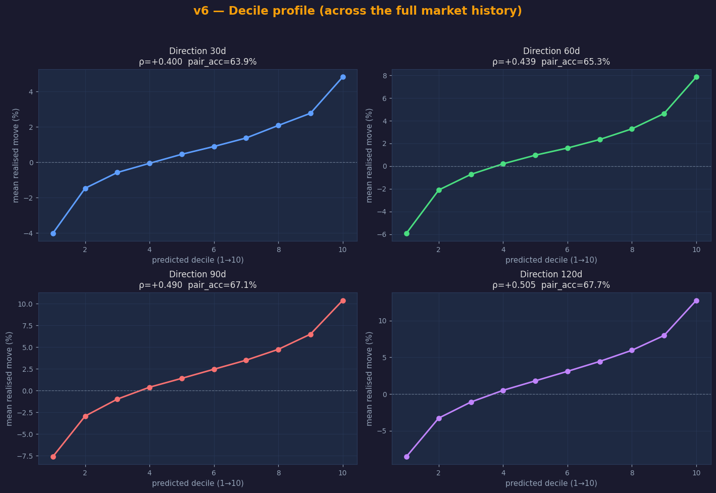
The line should rise from bottom-left to top-right. Decile 1 (the model's lowest-confidence picks) is meaningfully negative for every Direction model. Those tickers go down on average. Decile 10 is meaningfully positive. Direction 120d is the strongest: bottom decile averages about −8.5% and top decile about +12.8% over the horizon, a spread of roughly 21 percentage points.
2. Directional accuracy: how often is the sign right?
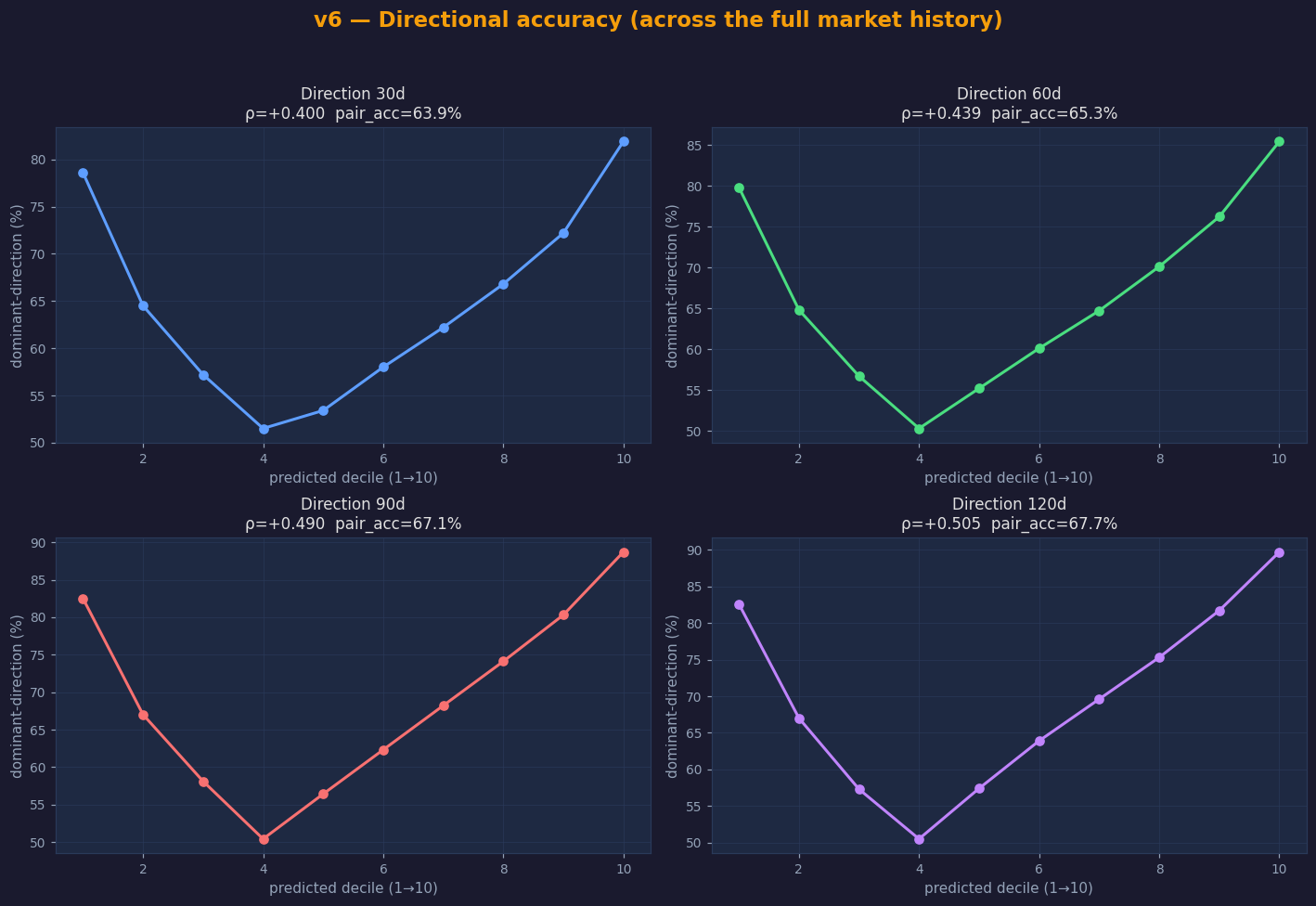
This is the chart to look at first if you're trying to translate "Spearman 0.50" into something intuitive. The middle deciles sit near 50/50 (the model has no view), but at the extremes accuracy climbs above 80%. For Direction 90d / 120d, the model is right on direction roughly 89% of the time in the top decile and 83% in the bottom decile.
3. Magnitude: does conviction correspond to size?
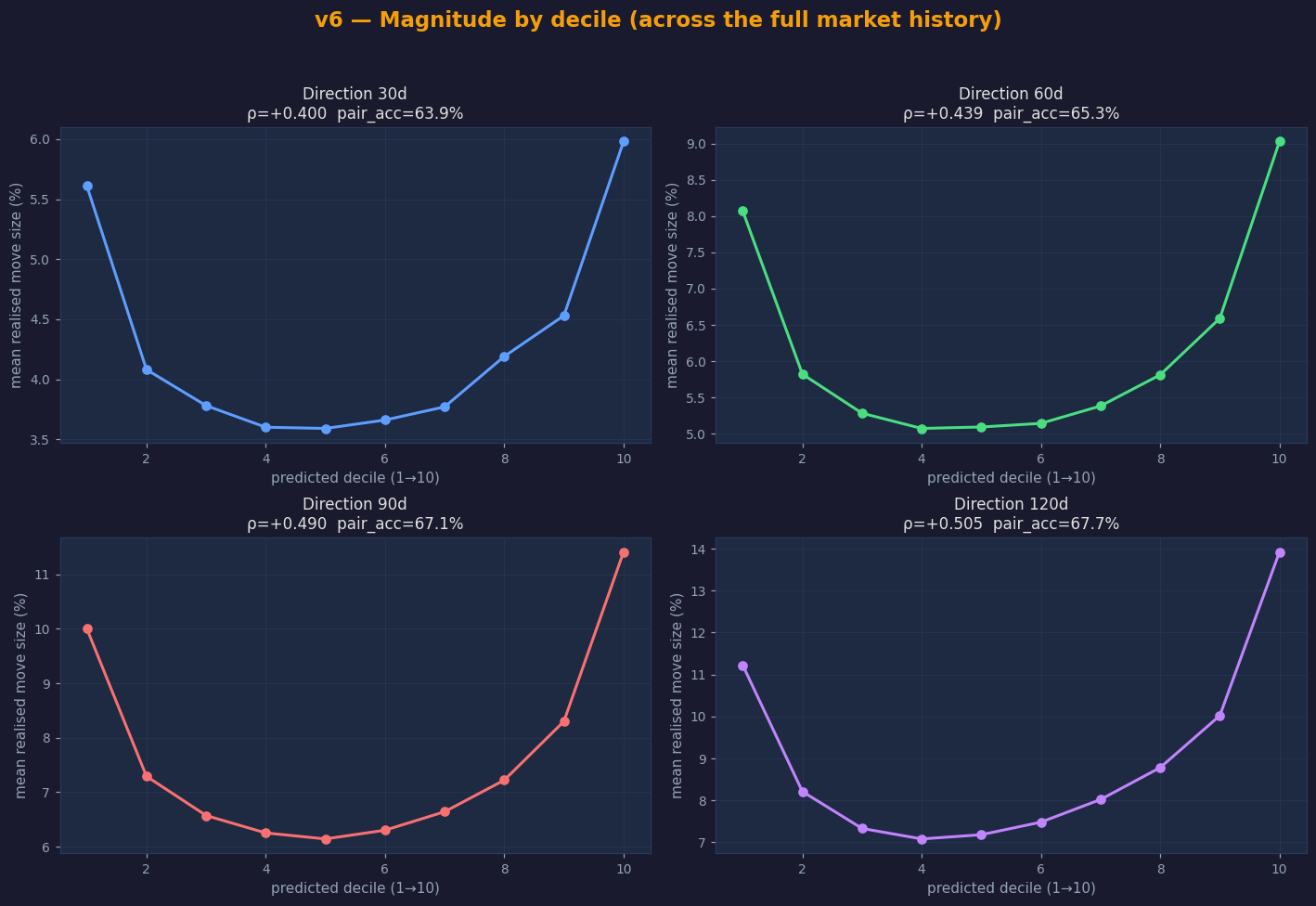
The U-shape says the model is also picking bigger moves at the extremes, not just sign-correct small ones. Direction 120d's top decile averages a realised move size of roughly 14% versus about 7.5% for the middle deciles. The same shape holds for every Direction horizon.
Caveats and things to remember
The raw score isn't a return forecast
A score of +1.20 doesn't mean "12% expected return". The model is trained with a ranking loss, so the output scale is whatever falls out of the network, not a calibrated return. The meaningful quantity is the percentile the score implies. Within a single day a larger raw score does carry stronger conviction, because it lands in a higher percentile, and higher percentiles average bigger moves in the predicted direction (the charts above quantify this). What you cannot do is compare raw scores across days, or read the raw value as a percentage return; the scale isn't fixed and isn't calibrated.
Direction and volatility: different units
Direction scores rank by where price ends up. Volatility scores rank by how big the move is, regardless of direction. A high direction score and a high volatility score can both be true for the same ticker (a big upward move) or sharply disagree (volatile but flat). The two families' raw scores aren't directly comparable; compare within a family or use their respective rankings.
Survivorship
Training data is built from tickers currently in the universe. Delisted / acquired tickers that never got into the index aren't represented. The model doesn't have a view on "what happens if this ticker disappears".
Combine with the statistical model
For an active trendline (within 2% of price), the statistical model tells you how its specific feature combination has historically behaved. If the ML rank score is high and the line's statistical hold-rate is well above the base rate, both signals agree, and that's a stronger conviction than either on its own.